Namma Sangam
Logo, identity and packaging for a South Indian food brand
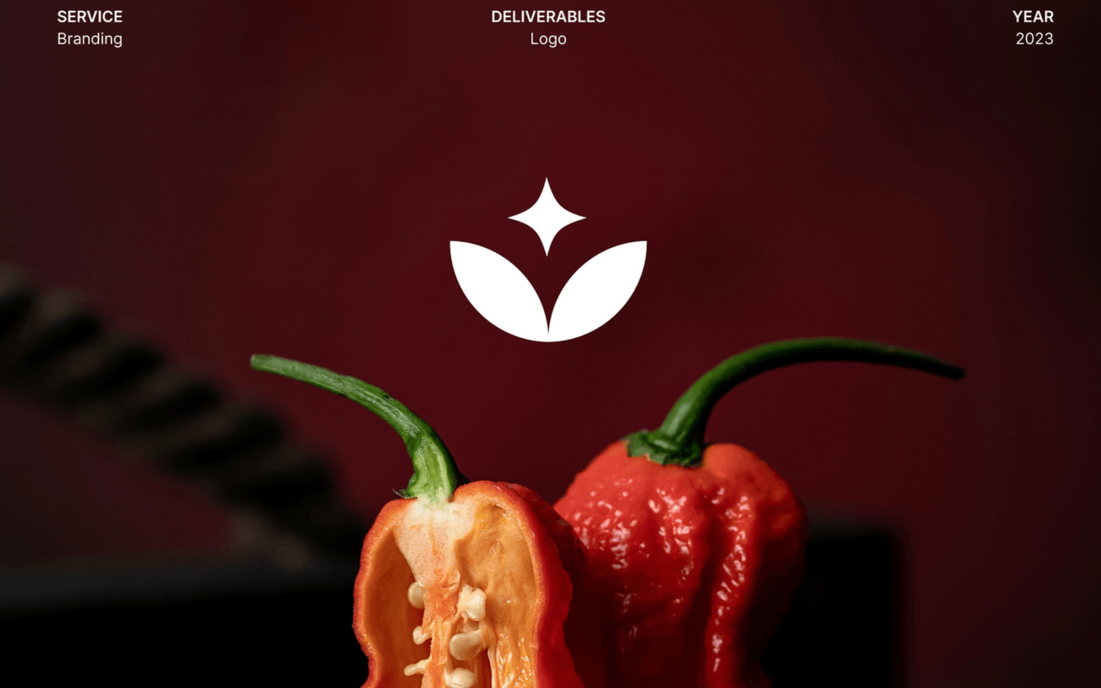
Namma is “ours” in Kannada and Tamil. The brand sells South Indian food, and the identity had to read as regional and specific without falling into the usual shortcuts — no temple silhouettes, no banana-leaf textures, no scripts used as ornament by someone who can’t read them.
The mark
Two leaves rising into a four-point spark. Built on a construction grid so it holds at any size, and drawn as a single solid form so it survives being embroidered, foil-stamped, or printed one colour on a spice pouch.
It reads as a plant and as a flame depending on how long you look at it, which is the right ambiguity for food that is both fresh and hot.
Palette
Dark green #002624 as the base, tiger’s eye #EA9E3E as the accent, seashell #FFF5ED as
the paper. The green is deep enough that product photography — chillies, spices, oil — sits
on it without either fighting for the same register.
Application
Logo system, packaging, and the identity applied across the brand’s collateral. The photography direction is part of the identity rather than a separate exercise: shot dark, lit hard from one side, with the mark reversed out in white over it.