Havmek
Engineering credibility with an editorial voice, for a seafood-equipment maker
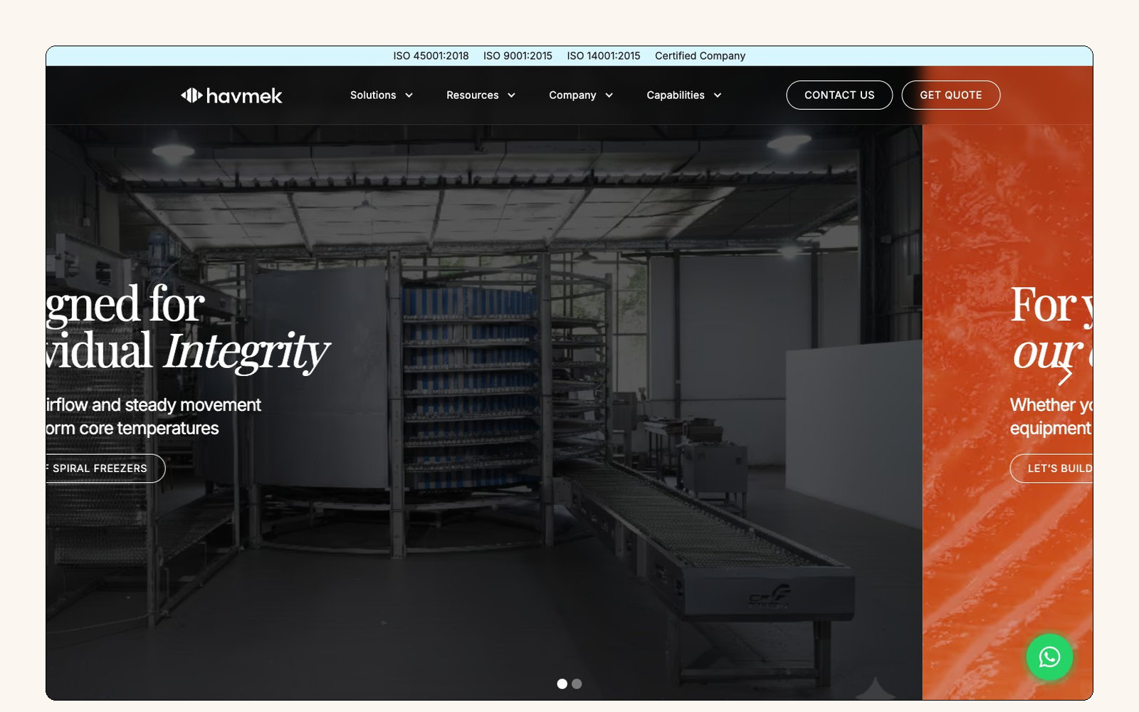
Havmek builds industrial seafood-processing lines and sells them to factory managers and procurement teams across India, Europe and the UK. For your seafood line, our engineering delivers.
The buyer is signing off a capital purchase, so the site has two jobs at once that usually pull against each other: prove the engineering is serious, and not look like a 2011 PDF.
Warm, not clinical
Industrial B2B defaults to cold blues on white. This runs a warm cream page —
#FCF6F0 — under a deep navy #0C275B, with a pale cyan #D7F6FE for CTA sections and a
frosted-glass navigation bar over the hero imagery.
The warmth is doing real work. Seafood processing is a food business as much as a machinery business, and a palette borrowed from editorial food photography lets the product images sit in the page instead of fighting a corporate blue.
The system underneath
Documented tokens for the full colour set, typography scale, and surface treatments —
including the specific overlay values that let white type stay readable over hero
photography (#000 at 30–35%, and white at 40% for the nav glass). Those two numbers are
the difference between a hero that works with any photograph and one that has to be
re-tuned every time marketing swaps the image.
Four locations in the footer — Delhi, Pune, Dublin, London — because for this buyer, “can you support us locally” is the actual question behind the enquiry form.